Instagram Credits
A credit protection feature for digital artists on Instagram
Other Projects

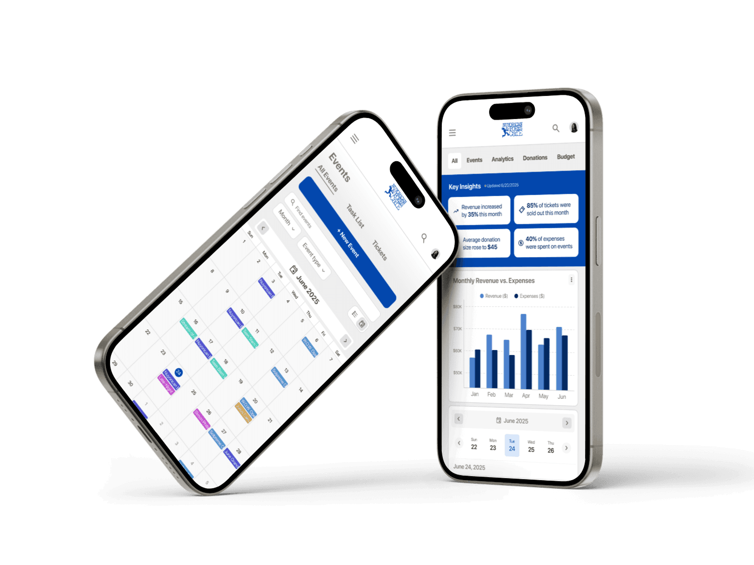
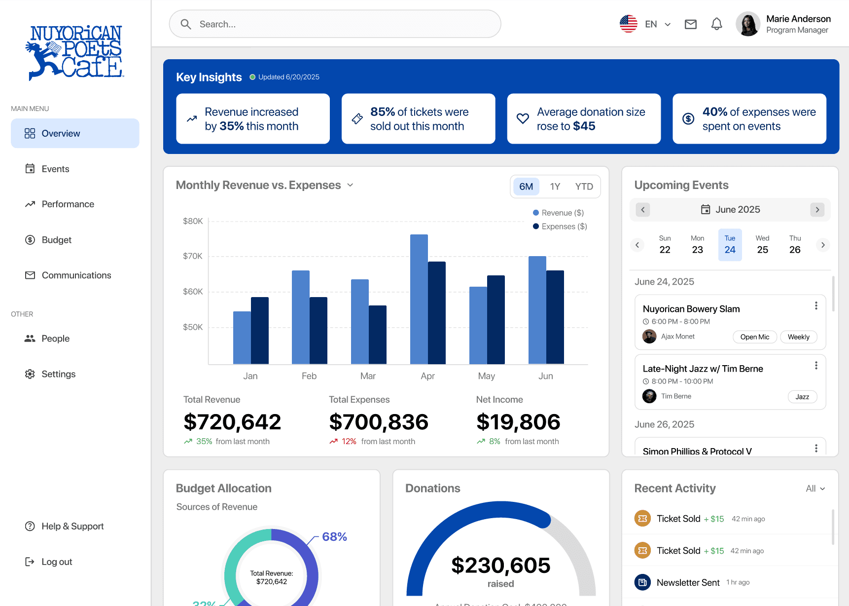
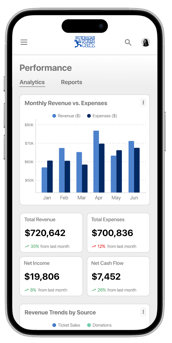
NPC Dashboard
Helping streamline administrative tasks and visualize key datasets for a non-profit
160 hours
February 2025
UX/UI Designer


TOOLS
Figma
FigJam
Miro
PROBLEM
Undergoing a 3-year renovation project, NYC's most well-known multi-arts institution with 50+ years of history, the Nuyorican Poets Café is looking for a change. With the staff frustrated with its current outdated and scattered operational system, they need a centralized workspace that better equips them for their day-to-day operations and long-term decision-making.
SKILLS
Responsive Web Design
Data-centric
Interaction Design
Card Sorting
Usability & A/B Testing
Flow Design & IA
OVERVIEW
Planning events in a nonprofit can be overwhelming, especially with limited time, staff, and budget. For this project, I designed a data-driven internal dashboard tailored to the nonprofit's needs. By streamlining workflows and presenting actionable insights through visual analytics, my solution aims to improve overall work efficiency and performance across the organization.
GOAL
Design a tool that efficiently streamlines existing systems and workflows and helps the organization create better informed business strategies
SOLUTION
An Internal Dashboard
to Manage Workflows and Analyze Data
Centralizing operations and improving work efficiency by streamlining processes and analyze acquired data into valuable insights.
01
Evaluate the organization's performance at a glance.
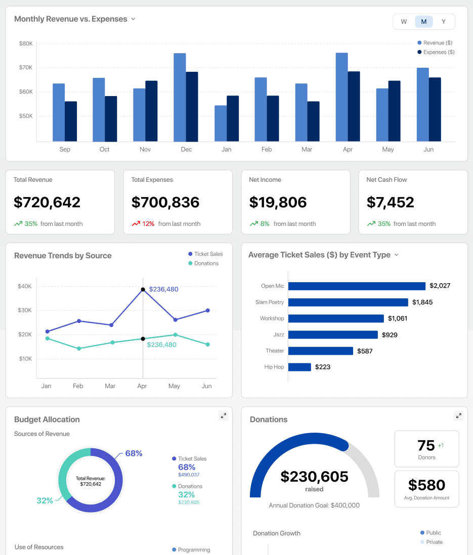
Users can quickly assess important information about the organization, like monthly revenue growth, donation progress, details about upcoming events, and more, directly from the dashboard's Overview page.
02
Create and manage events seamlessly with integrated features.
In the Events page, users can easily create and customize events with relevant details like speakers, ticketing, and agendas before publication. All events are then managed in a joint calendar and list view with event analytics and ticket sales.
03
Assess the organization's impact with easy-to-read charts and essential performance data.
Users can explore trends in donations, event engagement, and overall growth over time through dynamic charts and metrics designed to highlight important insights over time.
View Prototype
Here's how I got there
BACKGROUND
What is the Nuyorican Poets Café?

The Nuyorican Poets Café is a renowned cultural institution in New York City that has served as a vital hub for poetry, music, theater, and spoken word since the 1970s.
As a non-profit organization, the Nuyorican Poets Café is a creative events space for works of poetry, music, theater, and visual arts as a means of social empowerment for minority and underprivileged artists in the area.
It is most known for its performance poetry scene.
Primary Program Initiatives
Open Mic Events & Poetry Slams
Jazz & Theater Performances
Creative Workshops
Collaborations w/ Local Communities
Corporate & Local Donations
As of October 2023, the Café has temporarily shut down for a new 3-year reconstruction and renovation project. With the Café closed, the team could be interested in updating their internal dashboard to host and manage the many functions of the organization in a centralized digital space.
RESEARCH
Who is the dashboard designed for?
To help the organization's internal workflow, the dashboard would be intended for internal staff and organizers of the organization. Target users would include event coordinators, board members, program managers, and other staff members who work at the Café.


User Personas
METHODOLOGIES
How can I empathize with the staff?
To design for the organization, I need to understand the priorities and needs of the organization, including their goals, workflows, and key metrics (KPIs) so that I can understand the habits, pain points, and needs of target users.
User Interviews
To understand the needs and priorities of people who work in non-profit organizations.
Moderated Card Sort
To learn how my target user would prioritize and sort through specific datasets, information, and task flows.
Competitive Analysis
To learn established dashboard design patterns, data visualizations, and interaction use cases.
USER INTERVIEWS
How do non-profit organizations function?
I recruited a few research participants to talk about their experiences working at a non-profit organization, to understand the workflows and day-to-day operations of both event coordinators and executives.
YL
"We got funding from all kinds of places. Sometimes it was hard. It depends really. But I think it was mostly from applying to government grants."
"Because it is a nonprofit, it's way easier for [volunteers] to just kind of drop out midway… which was why it took so long for us to finish the project."
CD
MODERATED CARD SORT
How would users organize and act on data?
For my second activity, I had my research participants imagine themselves as the Nuyorican Poets Café staff and sort sticky notes representing different sets of data under general categories within a typical internal dashboard.
In this closed card sort, they categorized each element within a given category, with the option to make their own, and then rank them in order of importance. This helped me get a better sense of the information hierarchy.


COMPETITIVE ANALYSIS
How do other dashboards present data?
To identify effective design patterns and usability standards, I analyzed several nonprofit and data-focused dashboards. This helped uncover common UI conventions—such as modular layouts, prominent KPIs, and filterable tables—that support task clarity and reduce cognitive load.

KEY INSIGHTS
What do I take away from the research?
From the data obtained from user interviews, card sort, and competitive analysis, I was able to conclude the following key insights:
Non-profits vs. Businesses
Managing a non-profit is very different from a typical business model because (1) sources of income are difficult to acquire and vastly unpredictable and (2) personnel changes often so work efficiency is unpredictable as well.
Decision-Making Factors
Executives and stakeholders of non-profit organizations typically make decisions depending on performance indicators, competition, trends, and the organization’s mission and core values.
Primary Dashboard Features
The most important features to be added to a non-profit event-based dashboard include the workflow to create an event and an attendee registration, general event information, list of event speakers, and a calendar of events.
Secondary Dashboard Features
Secondary features include a graph of net revenue for events over time, the workflow to create a newsletter, and the volunteer application process.
IDEATION
Defining project goals
Keeping the key insights in mind, I started ideating solutions for the presented problem. Considering user needs, business needs, and technical considerations of the product, I formulated a single project goal that would form the backbone of the product:
PROJECT GOAL
Create a functional and reliable all-in-one dashboard that improves work efficiency and business performance, encouraging a modern, digitized workspace for company growth

FEATURES
Ideating & prioritizing features
To define which features would best meet user needs while aligning with project constraints, I compiled a formative feature set informed by user research insights. Then, I prioritized features into an Impact-Effort Matrix to evaluate which features would deliver the most value with reasonable development effort, helping to guide a focused and strategic MVP.

SITEMAP
Navigating the dashboard
With my goals defined and a list of features to consider, the next step was to select and piece together the elements that would make the dashboard.
With a design as complex as a data-centric dashboard, I wanted to ensure that my information hierarchy was clearly defined. I started by listing the kinds of data and features I wanted the dashboard to include in its MVP, taken from the feature set.
Then, I utilized my research observations to prioritize the information: the most important of all categories resided in the Overview page (home page) and each sub-page would house more specific detail of the elements presented in the home page. Even with the main screens, I prioritized features with a simple priority chart.

FLOWS
Connecting the dots
Because events is the Cafe's primary focus, event creation and management would be the dashboard's primary flow. Additionally, the dashboard would provide lots of easy-to-read data visualizations to provide a productive way for users to assess crucial information at a glance.

See flows
DESIGNS
Building the dashboard brick by brick
Following insights gathered during the research and synthesis phases, I moved into sketching and designing the dashboard's wireframes.. Focusing on translating user needs into intuitive and responsive interfaces, I experimented with both familiar and unconventional design patterns to make up the website's home screen and primary flow.


COMPONENT LIBRARY
Developing the components & interactions
I developed a modular component library tailored for data-heavy interfaces, prioritizing clarity, reusability, and interaction consistency. Components included interactive charts, filter controls, dropdowns, data cards, and tables—all designed to support responsive behavior and accessibility. The system remained scalable while ensuring cohesive visual and functional patterns across the dashboard.

FINAL DESIGNS
Finishing touches on the dashboard
With a growing component library, I continued designing and iterating card after card, page after page. Soon after, I had developed hi-fi wireframes for both the desktop and mobile versions of the dashboard with scalable interactions that allowed users full control over the type of data they wanted to see and the kind of actions they'd like to perform.


TESTING
Turning feedback into functionality
To validate the usability of my high-fidelity prototype, I conducted several user tests that revealed both strengths and areas for refinement.
Overall, users found the main task flows, such as discovering and reviewing workspaces, intuitive and easy to follow. However, some confusion arose around the mobile navigation, which prompted a need for a simpler mobile design and consistent content.
In response to this feedback, I implemented several key iterations:
Removed the secondary anchor links in mobile navigation to avoid confusion with primary navigation
Added a sub-heading to the Upcoming Events mini-calendar to clarify its purpose
Adjusted the copy within the event creation flow to better communicate features
Included additional action buttons in the event page, such as "Share" and "Edit," for more user control
REFLECTION
Designing for data and user interactions
Throughout this project, I gained some valuable lessons not just about responsive design but also in designing thoughtfully for data-rich interfaces and complex user interactions. Balancing clarity and usability in a limited space with dense information really challenged me to be more intentional with both structure and visual design.
01
Data-centric Design
For this project, I learned to establish the information hierarchy early on to understand what kinds of data my target users would find most valuable to their work. I made sure to reinforce the clarity and readability of my designs as well as its detail and usability by prioritizing different types of data visualization.

02
Interaction Design
To cater the dashboard to users with different goals, I focused on creating a seamless flow of responsive components, micro-interactions, and intentional hierarchy to guide users through different tasks. This strengthened my ability to design systems that were not only functional but enjoyable to use.

03
Dashboard Design
Finally, designing for a real dashboard deepened my understanding of structure and scale. I learned how to design across breakpoints, maintain visual consistency, and support scalability through a thoughtful component system. Each iteration helped me balance aesthetics with utility, giving me a clearer grasp of what makes a good dashboard truly work.
FUTURE RELESEAES
Looking ahead beyond the MVP
While the MVP of this dashboard focuses on the primary analytical data and event creation flows, I have several additional extensions for future releases to expand the dashboard's functions and capabilities to handling budgets, external communication, and user specific settings.
Phase 2
Budget
For Phase 2, I would introduce a Budgets page that would include a variety of features including but not limited to:
High-level metrics and visualizations summarizing the total budget, spending to date, and budget vs. actuals
Interactive graphs and category breakdowns with deeper insight into funding distribution
Phase 3
Communications
For Phase 3, I would introduce a Communications page that would include a variety of features including but not limited to:
Hub for email campaigns, newsletter distribution, social media performance, and event communications
Visual metrics for social growth in the organization, like open rates, engagement levels, and click rates
Wanna chat about this project?
Let's find a time to call!