


Dashboard - NPC
A data-driven responsive dashboard for a NYC non-profit
Instagram Credits
A credit protection feature for digital artists on Instagram
Other Projects

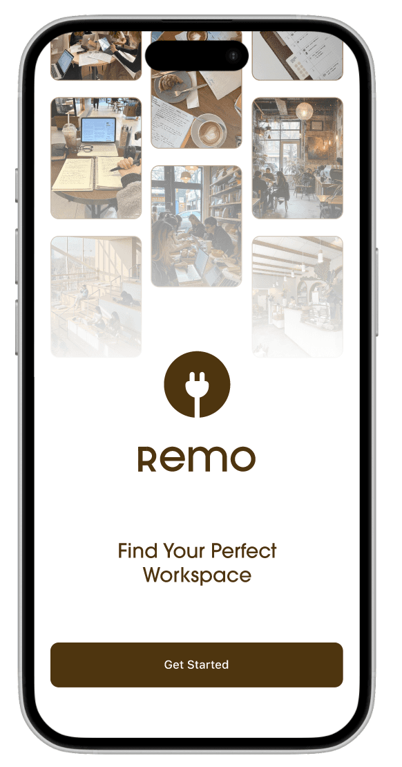
Remo
Discover the best workplaces to get things done.
160 hours
April 2025
Product Designer


TOOLS
Figma
FigJam
PROBLEM
Remote workers struggle to find relevant information about public workspaces online, resorting to trial-and-error and getting frustrated when a workspace does not meet their expectations. With the rise of remote work, there’s growing demand for a tool that can highlight key environmental attributes to evaluate public workspaces for focus and productivity.
SKILLS
End-to-end Design
Design System
Workshop Facilitation
Branding
Usability & A/B Testing
Flow Design & IA
OVERVIEW
For remote workers looking to focus at cafés or libraries, finding the right spot is always a gamble. Reviews rarely touch on the practical factors that make or break a workspace. This project was born out of this everyday pain point, shaped by real user frustrations, to help people find workspaces that actually work for them.
GOAL
Create a product that can gather reliable information on public workspaces and showcase whether or not they are suitable for a user's specific workstyle
SOLUTION
Introducing "Remo,"
An App for Workspace Discovery
Helping users discover public workspaces optimized for their productivity, either at a quiet café, a sunlit library, or a lounge with reliable Wi-Fi.
View Prototype
01
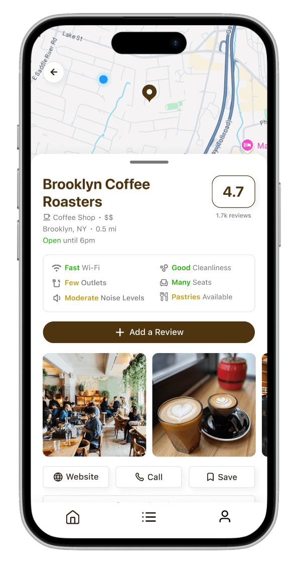
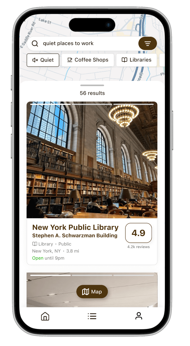
Browse workspaces based on ratings and reviews about its work environment.
Users can scroll through a personalized feed of nearby workspaces with quick visuals that capture each spot’s vibe and layout, plus an auto-generated "work-friendliness" score based on user reviews.
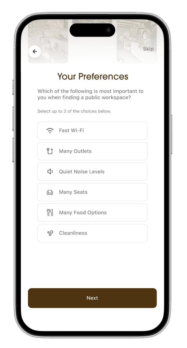
02
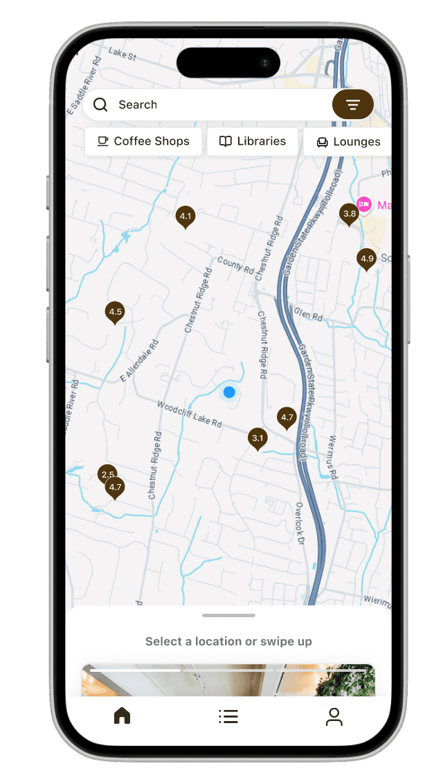
Quickly find and save workspaces in your area that fit your specific productivity needs
Whether users work better in quiet spaces, need many outlets, or prefer large table sizes, Remo's quick filter and search features help spotlight workspaces that would suit their needs.
03
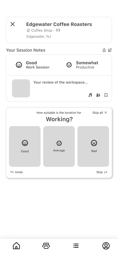
Share workspace experiences while curating a personal map of your favorite spots
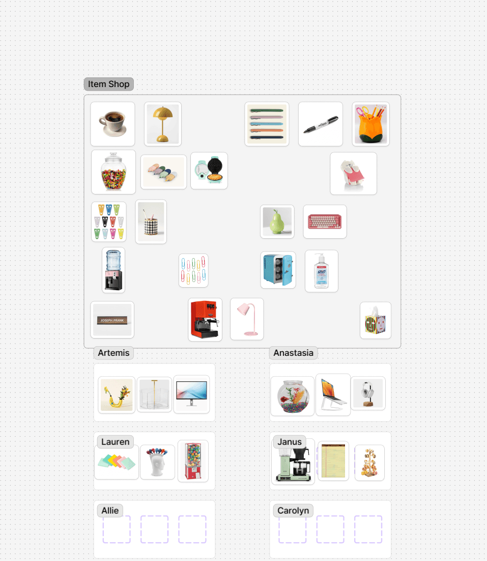
By reviewing workspaces, frequent mobile workers can contribute to a community of remote workers while also crafting their own lists and maps of their experiences and work sessions.
RESEARCH
Who are the target users?
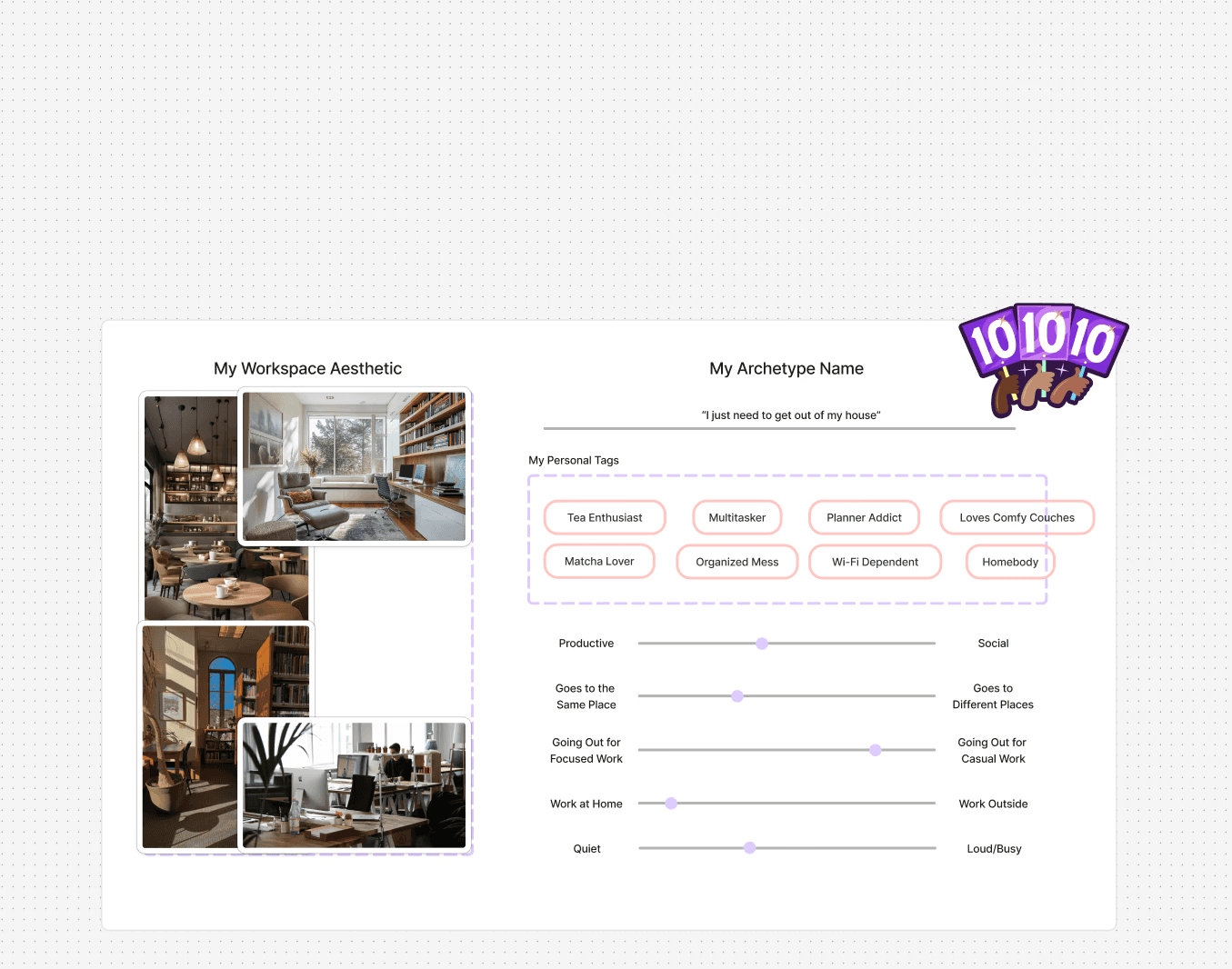
The target users include remote workers, freelancers, students, and digital nomads who frequently work from public spaces like cafés, libraries, and lounges. They value flexibility, productivity, and reliable environments and often rely on peer insights to find the best places to focus outside of home offices.
Here's how I got there
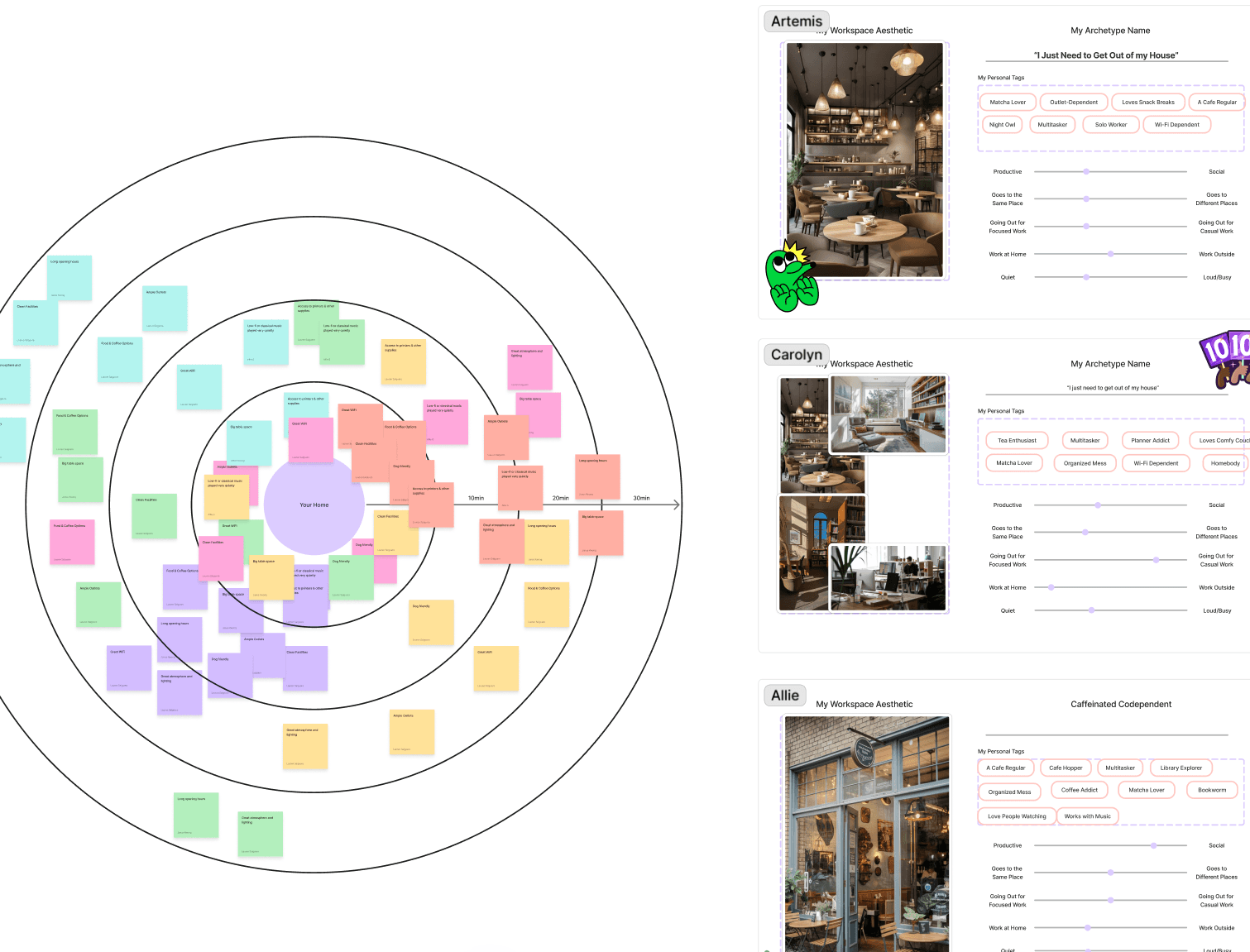
User Personas
Design Thinking Workshop
To understand potential users, their existing pain points, and their real experiences with public workspaces.
Cross-functional collaboration
Structured creative ideation
User empathy
Competitive Analysis
To evaluate the current market and likely competitors as well as their unique value propositions.
Market assessment
Competition identification
Project alignment
METHODOLOGIES
How can I empathize with remote workers?
To design for remote workers, I need to learn more about the kinds of experiences remote workers have when finding and working in workspaces outside their home or office and what they value in the remote work experience so that I can understand the habits, pain points, and needs of target users.
01 - DESIGN WORKSHOP
How do people work in public workspaces?
I invited a small diverse group of participants representing my target users, including remote workers and café hoppers, to help understand habits and workstyles when discovering public workspaces.

Design Thinking Workshop
2 hours
6 participants
SYNTHESIS
How do I make the data digestible?
The workshop gave me a lot of insight into the many ways people view and use public workspaces — and there are a lot of different ways. Some people only go out occasionally for a breath of fresh air, while others need to go out to be productive.
Yet to make a product that suited my target users, I needed to understand their biggest pain points and approaches to workspace discovery.
View synthesis assets


To make the data retrieved digestible, I sorted the notes into an affinity map and a priority chart to find what patterns were emerging the most frequently among the six participants.
LESSON LEARNED: WORKSHOP FACILITATION
Hosting this workshop taught me how to approach user research creatively in a way that truly engages those involved. By setting up fun activities that built collaborative, constructive discussions, I was able to capture additional insights from participants' overall reactions and candid remarks.
The session included three activities (plus warm-up and wrap-up), each targeting a key research objective:
I found that people only really go out to work for a workspace's environment. The majority prefer to work in their usual, comfortable offices. They go out predominately for a change in scenery.
Their biggest pain points are when their basic needs required for remote working are not met. People expect to find fast Wi-Fi and food options in public workspaces but have poor experiences if a place is lacking these necessities.
Positive Features
Negative Features
Great environment and lighting
6
Distractions
6
Wi-Fi
5
Loud, bad music
5
Food and coffee options
4
Bad Wi-Fi
4
Outlets
4
Uncomfortable seating
3
Cleanliness
4
Limited seating
2
Quiet music
3
Poor cleanliness
2
Access to printers and supplies
2
Bad lighting
2
Big table space
2
No outlets
2
Long opening hours
2
Cold temperatures
1
Easy parking
1
Expensive menu
1
Dog-friendly
1
Inconsistent themes
1
Frequency chart of key observations from Features Exercise
02 - COMPETITIVE ANALYSIS
Who are some competitors?
Taking a look at the competitors and assessing their strengths and weaknesses really helped me solidify where I see this app fitting into the market. There are lots of existing ways for people to find public workspaces, so I decided to take the approach that makes the experience more specific to workspaces as well as more personalized, social, and fun for the user.


KEY INSIGHTS
What do I take away from the research?
From the data obtained from the design workshop, I was able to conclude the following key insights from affinity mapping and comparative analysis:
Prioritizing Environment
People primarily go out to work for a workspace’s environment, then for its services.
A Sense of Exploration
People tend to choose their public workspaces based on a sense of exploration and whatever is reliable and nearby.
Workspace Expectations
People expect to find fast Wi-Fi, table availability, food options, outlets, and clean and quiet environments in public workspaces. Falling short of these expectations creates a very disappointing experience.
Many Needs, Few Wants
Big table space, quiet music, and comfortable seating are also great features that people like with varying degrees of necessity.
IDEATION
Defining project goals
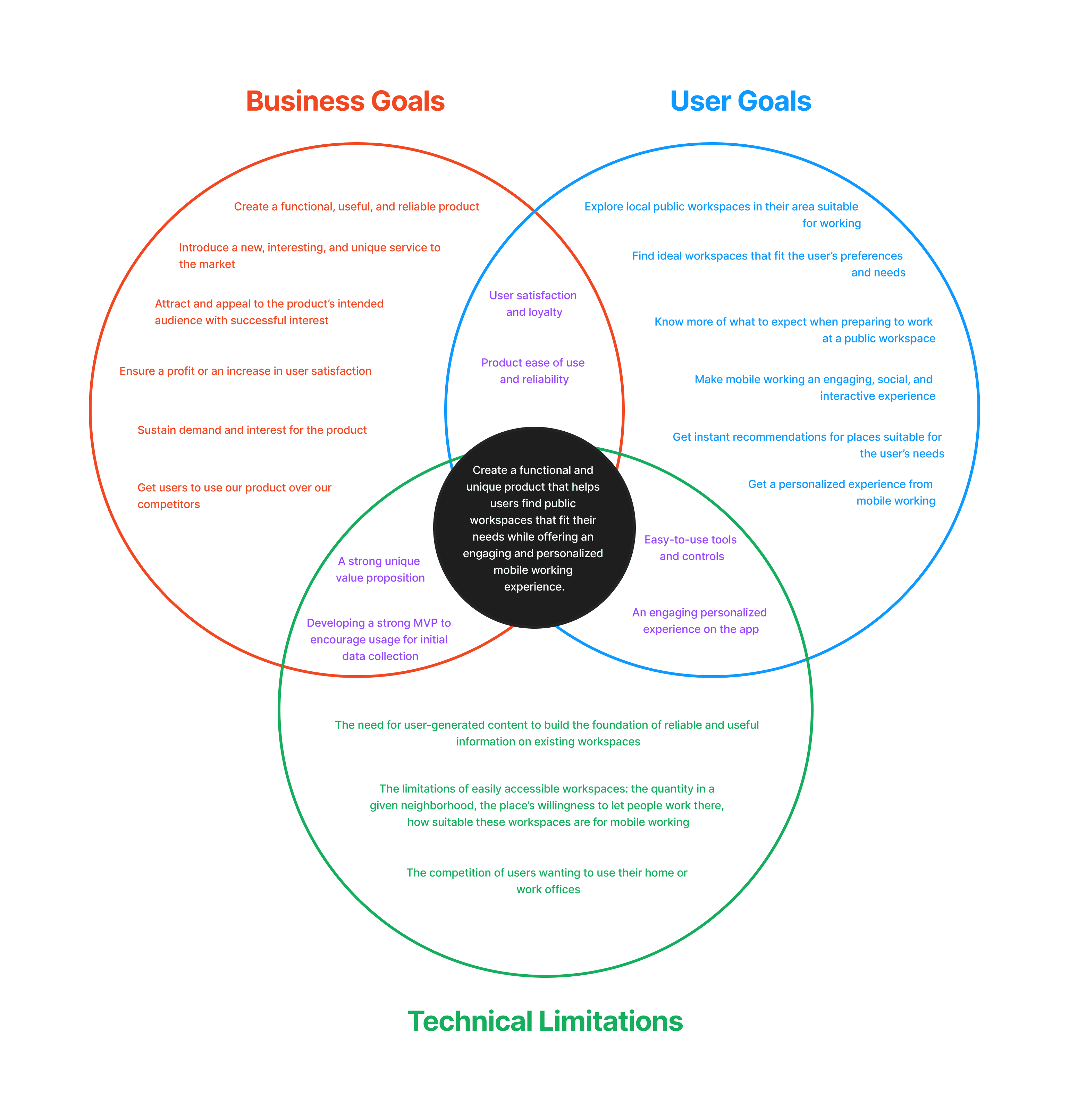
Keeping the key insights in mind, I started ideating solutions for the presented problem. Considering user needs, business needs, and technical considerations of the product, I formulated a single project goal that would form the backbone of the product:
FEATURES
Ideating & prioritizing features
To define which features would best meet user needs while aligning with project constraints, I compiled a formative feature set informed by user research insights. Then, I prioritized features into an Impact-Effort Matrix to evaluate which features would deliver the most value with reasonable development effort, helping to guide a focused and strategic MVP.

FLOWS
Connecting the dots
At this point, Remo has started to take shape. I wanted to design an app where users could get information about workspaces through crowd-sourced reviews, which would provide authentic and real-time information for users about a location. Users would also need to create an account and choose their preferences to get a more personalized experience.
PROJECT GOAL
Create a functional and unique product that helps users find public workspaces that fit their needs while offering an engaging and personalized mobile working experience.
This created two main flows:
1
2
Onboarding Flow
Review Flow

With this identified, I created user and task flows to visualize how users might navigate the app. These flows highlighted decision points and ensured the overall structure supports user goals identified during research.
LESSON LEARNED: SCOPE CREEP
Throughout the ideation phase, I encountered scope creep as new ideas continuously emerged. But I learned to regularly keep myself in check, remembering to prioritize the user's needs and stay aligned with the project’s primary goals. Utilizing tools like the Impact-Effort Matrix, seeking feedback from mentors, and documenting my thought process ensured that I always put the user first.
Triple Venn Diagram for project goal alignment
View flows
Prioritized feature roadmap with integrated Impact-Effort matrix
DESIGNS
Bringing the app to life
Following insights gathered during the research and synthesis phases, I moved into designing Remo’s experience. Focusing on translating user needs into intuitive and responsive interfaces, I experimented with both familiar and unconventional design patterns to make up the app's home screen and review flow.


Low-fidelity wireframes
BRANDING
Crafting Remo's brand identity
Before tackling higher fidelity screens, I wanted to establish the app's brand identity. The branding for Remo was designed to balance professionalism with approachability, merging productivity with self-expression. The visual identity consists of a minimalist and clean aesthetic, evoking authenticity, community, modernity, and elegance.

Brand values and moodboard
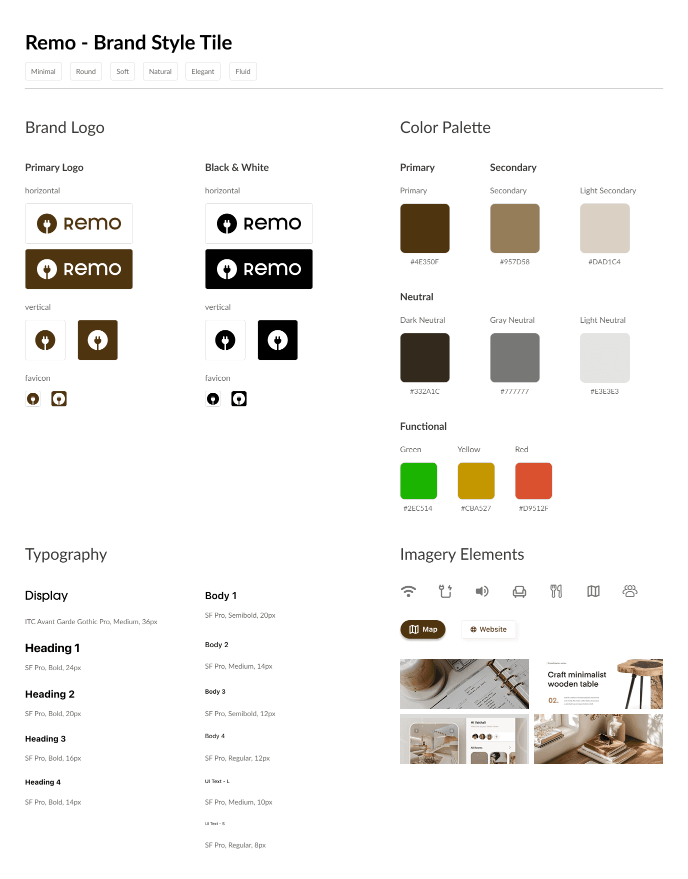
Brand style tile
DESIGN SYSTEM
Crafting the building blocks
Once established, I began to meticulously craft Remo's design system from the smallest design elements, building it up with intention and precision one pixel at a time. With extensive component work, I was able to create flexible UI patterns for optimal scalability, responsiveness, and consistency.

LESSON LEARNED: DESIGN SYSTEM
Building a comprehensive detailed design system is tedious work but worth it. By organizing and labeling components from the atomic level up, I was able to speed up my workflow and ensure consistency and scalability throughout my designs.
FINAL DESIGNS
Designing Remo, the workspace discovery tool
With a much stronger foundation, I continued designing and iterating through a continuous flow of feedback from my peers. After condensing the review flow, implementing Remo's visual identity, and adding interactions, I finalized the MVP.


High-fidelity wireframes of key screens
TESTING
Turning feedback into functionality
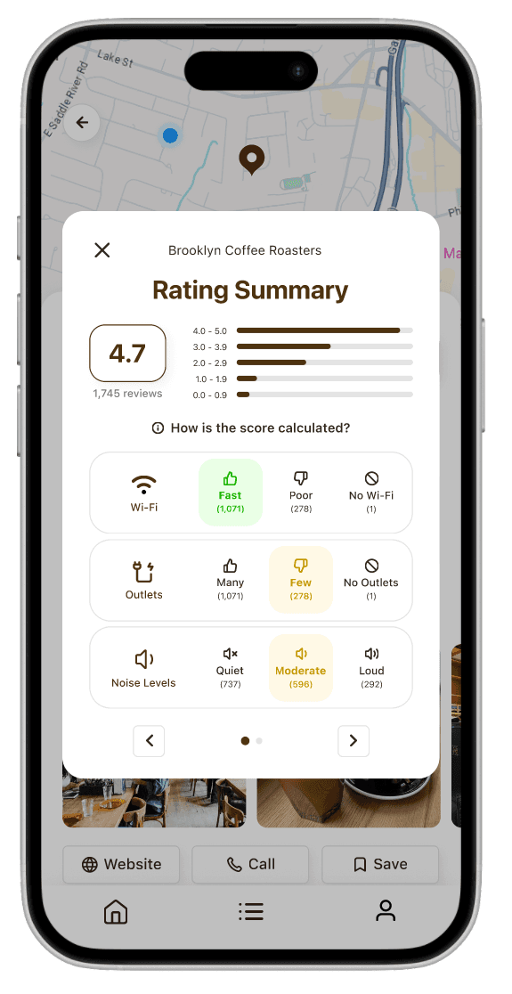
To validate the usability of my high-fidelity prototype, I conducted usability tests with 7 users and revealed both strengths and areas for refinement in my designs.
Overall, users found the main task flows, such as discovering and reviewing workspaces, intuitive and easy to follow. However, some confusion arose around the points system in the review flow, which prompted a need for clearer onboarding and contextual explanation.
In response to this feedback, I implemented several key iterations:
Added a brief info pop-up to clarify the purpose and function of the points system
Adjusted color contrast and palette choices to meet accessibility standards
Included a shortcut for quickly checking a location’s opening hours
Streamlined fast filter suggestions to reduce cognitive load
Replaced food-centric sample reviews with examples more relevant to productivity and work
REFLECTION
Growing through systems, collaboration, and focus
Throughout designing Remo, I gained some of my most important lessons not just in interface design, but in managing process and collaboration.

01
Design Systems
Building a full design system from the ground up taught me how critical consistency and structure are to a scalable product and pushed me to become much more fluent with components, variants, and atomic design principles.
02
Design Thinking Workshop
Hosting the workshop taught me how to cultivate a collaborative learning environment that leveraged the perfect balance of sticking to a structured, thought-out itinerary but also leaving room for open, candid discussions. All while gaining valuable research insights!

03
Scope Management
Finally, overcoming scope creep was a huge lesson. There were endless features I could have added, but I learned that a strong product is built through focus: solving a core user need exceptionally well before expanding further. Balancing ambition with restraint became a key part of my design approach by the end of this project.
FUTURE RELEASES
Looking ahead beyond the MVP
While the MVP of Remo focuses on helping individuals discover and evaluate workspaces efficiently, there are several planned extensions for future releases to deepen community engagement and expand user value.
Phase 2
Student Focus + Community Feed
For Phase 2, I would introduce 2 primary features:
Targeted expansions for students that would include campus recommendations and study group collaborations
A private community feed that would allow users to view and interact with reviews from friends and favorite reviewers
Phase 3
Live Seating and Floor Plans
For Phase 3, I would introduce additional features:
Live seating availability or workspace occupancy through partner integrations or crowd-sourced updates
Interactive 3D floor plans showing table sizes and outlet locations
Wanna chat about this project?
Let's find a time to call!


